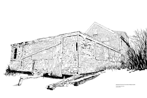
Updated after feedback from Mike:
I removed the grass on the side and added trees. This looks better and I have to say - less lazy!
I guess this can be classified as being done while I was away as well. I finished it waiting for the bus to take me home. It's a building in a terrible state along the beach in Provincetown and I used a crayon-like brush to get the rough effect I saw in it's details. It s pretty much all line work with no tones. I supposed I could have added grey to on side of the building to give it a more shaded and "3D" look but I don't think it needs that. I really like just black and white sometimes.


4 comments:
I think this works best with the shingles and lighter lines which look like they must have taken forever! Lots of great detail in this. The plants feel a little rushed and the thicker areas of black I'm not sure about. Overall, it's really cool and I can totally see why you like plain ol' black on white. Sometimes I miss it, too!
The actual place was covered in tree branches not grasses so I might go back and change that. I think I wasn't up to figuring out trees at that point.I also didn't want to hide the right side as much as it really was.
I never said lazy, I said 'a little rushed.' :D regardless, it came out really well and you should be proud.
You didn't say lazy, but it was! To be fair I have exhausted and did the easy way out to finish it before the bus came.
Post a Comment