Showing posts with label Flash Gordon. Show all posts

15 November 2024

Poster project: Flash Gordon poster ( finished (?)


I did redraw much of Flash's face as I was very unhappy with it. I showed Ming to a couple people they really liked it a lot so maybe Flash suffered from being my first vector portrait as well as me giving into some of my worse tendencies like making him too pale, especially the lips. For the ship I used a 3D model I made combining several Flash Gordon designs. I used it as a special effects test years ago. I was able to position as I wanted for the poster and drawing it was fairly straightforward. 

12 November 2024

Poster project: Flash Gordon poster - Ming The merciless


 I finished Ming and so far I think I like it... and of course, now I had the Flash portrait. I might start over or at least remake the eyes and mouth and see how that comes out. This one was going to have Ming's hands and his rings showing but I didn't want Flash, the focus of the poster to be a floating head and Ming to be more complete. I think Ming might have worked out better because he is much more of a cartoon with his heavy eyeliner and giant collar. The thing that really brought his face together when when I added the ears. 

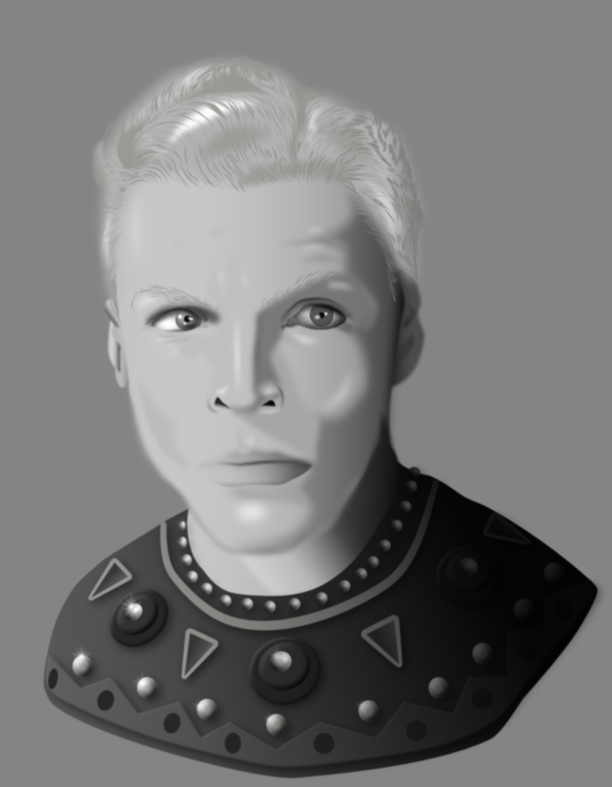
Poster project: Flash Gordon (Buster Crabbe version) poster


I have been starting and stopping and restarting this project for years now. I wanted to make Buster Crabbe front and centre with Ming, the spaceship and the cloud city as elements but I wasn't sure if I could get the likeness strong enough, especially when I decide I wanted to make it in Affinity Designer all in vector drawing. I more recently have been wanting to make portraits with AD and thought if I want to get to a place to do that this Flash Gordon project might be a good training ground and test. Afterall, all the people I'm drawing are dead and can't be mad if I do badly. 

This will work for the poster, though I am not sure I got the likeness as close as I would like. I used layers of shapes with blurred edges overlapping to get the soft blending for a more natural look over the overly clean 3D model look vectors can have. I think I really got the overly dyed blonde hair right. There are 100s and 100s of lines to make the hair and I added shapes for shading underneath to keep it from looking too flat. His shirt was inspired by but not copied from any one shirt or another from the series, there were a few to look towards for ideas and I think I get something with a little of all of them in it. 

I can still make adjustments as I go and likely will. I wasn't going to do Ming but now I think I will start him and see how it goes. 

The final poster will have an art deco feel and I don't think I'll do a logo or anything like that. I made one from the original movie version but it's pretty ugly and not having it will give me more options when making the composition. 


08 February 2015

03 February 2015

Nostalgia and effects tests in one

I loved Flash Gordon.. the original serials as a kid which were shown at a local movie house... usually before a Godzilla movie. (To be more precise, I loved Buster Crabbe.)

At one point I used the spaceship design from the serials in the behemoth video logo and also made an entire site with the ship landing on Mongo as my portfolio webpage, all in Flash, which seemed extra appropriate. As you can see, it was really primitive looking and was animated with a software called Swift 3D. it just spun on it's axis as everything did in the early days off Flash.


Now many years later, I decided to update the ship in Cinema 4D and use it as a test object for effects experiments. Video was taken at my friend's farm in Vermont and not well done I am sorry to say. I guess I was cold or just not paying enough attention.


Overall I am really happy with the new design. Turns out there were a few styles of ship used in the serials so I combined elements from all of them. Integrating it into real footage has it's challenges. It's very smooth, toylike and shiny. I didn't want to change that too much and make it look Steam punk or Jules Verne-ish but keep some of the art-deco aspects to it. I might make at least a drawing or two now from the serials or at least a poster and I can use this as a reference to draw from. Any excuse to look at photos of Buster I guess!

The video below is 3 separate tests. The last clip is actually the first test and I think it shows. The flyover was simple and effective (in my mind) and the pulling up to the barn clip is the most complex to pull off and I didn't exactly nail it. I need more practice and experimenting to get the total look of it being really there right. I like that I gave it a hard time making it's way through the snow. The snow was done with a plugin called magic snow which is great but not entirely real looking. They all have a sort of a "matte painting" look I would like to reduce in future.


Overall I achieved a Space Channel movie of the week quality which I suppose isn't terrible since it's only me figuring this stuff out on my own.


spaceshuip tests from Vincent-louis Apruzzese on Vimeo.

13 February 2013

Flash Gordon site from the past


At one time, the use of Flash was considered more cool than it is today and the ability to interact with animations was fun.. it got out of hand pretty quickly. This might be an example of that. But it was fun to do and that was point… to make the site fun. Sound isn't exactly in sync as it was on the site originally. Being obsessed with Buster Crabbe… I had to do it.