27 May 2020

Star Wars posters series


Well... why not?  Click to see larger versions.

The Star Wars models I downloaded from the internet over the years are a much higher quality than the 2001 models. I think that has a lot to do with the fans being so numerous and picky about  authenticity. Another factor has to be the age difference between the two properties. I have a feeling many of the 2001 models were made closer to the beginning of the home computer revolution while the Star Wars models are more recent. The models based on the Kubrick film seem to be super simple as if they were made for less powerful processors and with older 3D software. So there was some playing with textures but the overall geometry and details were spot on in most cases making the poster process much faster. 


17 May 2020

More 2001 posters


I couldn't help myself. The Aries shuttle, the round spaceship, I sent three days building myself. I had a model of it in my folder of collected 3D models, but I really didn't like it. It is still not all it could be and I might go back to it and maybe a few of the others and improve them as sort of a hobby.

MY idea was to get a striking image of each ship and I rendered a few options for each and hopefully picked the best ones.

Click on images to see more details.


14 May 2020

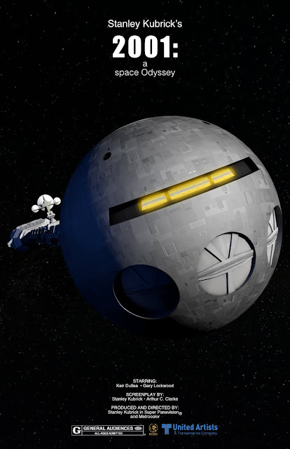
2001: A space Odyssey poster series


I had an itch to do something with 2001, one of my favourite films but didn't think doing one of my icon drawings would work. Instead I imagined a new set of posters and used information from the original posters such as the studio logos and the credits. I decided not to use the two tag lines on the 60's posters... too wordy. I wanted to really highlight one element and make it front and centre. I used 3D models - positioned and lit them instead of trying to find and alter images from the film. This way I was able to get exactly what I needed. I felt they needed an insane amount of detail. The star field is real, I took it in Colorado a few years ago.

Not all of these work as well as the others but I decided to show all 4 just for comparison.  The first two are my preferred images. The second are sort of runner ups, but I like them and put a good amount of effort into all of them.

Click any image to see more detail.


10 May 2020

Icon Illustration: Forbidden Planet


I was inspired to draw this after listening to the Forbidden Planet episode of Max, Mike, Movies!  awhile back and finally got around to doing it. It actually came together much more quickly than I thought. It took a few hours to draw Robby the Robot but the rest of the elements had less details than I remembered. This was all done in Affinity Designer so it's all vector illustrations. I looked at some hand drawn pencil drawings used for the ID monster animation (done by Disney Studios) and added some extra attention to the eyes. I drew it in pencil in Affinity Photo and then vectorized it to keep the rougher look it had in the film. Robby is mostly just a series of basic shapes, but tons of them with gradient fills to make them look 3D.

05 May 2020

In Production: Cask of Amontilado


Sets for this were made over a year ago and some of dialog was recorded last November. Then I prioritized making "28 Young Men" and "25 years Later".  I did the voice of Montresor but it was pretty terrible so I asked Mike Luce to re-do it and he graciously agreed.

Unlike my last 9 gothic horror animations, I decided to shake things up and go with animal characters instead of human. I think this will work better and as I got a little better making these types of characters the last couple of years it made the rigging and texturing go easier and work nicer. That said, I keep finding little corrections to make in the final models each clip so by the end, they should be perfect!

The image is of Fortunato, who will not end well in this story. The other, Montresor, is a raven based character. The setting is very dark and sombre so I added a coloured fill light to each character to keep them visible and colour coded those lights to match their roles in the story. Fortunato is warm light and Montresor is a cool blue.