13 November 2023
Website update for 2024
I was not happy with the last update I did for the behemoth website. mostly, I thought the menu setup just didn't work. I redesigned the logo and made the menu clearer and I hope more fun to look at. I added a large slideshow of work I have done and re-arranged the information on the other pages to make it easier to see as much as possible. My new animation was selected for several festivals so I wanted that information updated as well. I deleted the link for Instagram as I am off it officially now. There are some more animated sections of the site itself now. If anyone ever visits I hope they find it fun.
09 January 2022
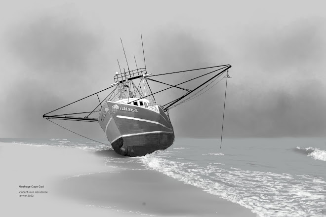
Illustration: Shipwreck Cape Cod
Hopefully my last drawing before I can go home. I want be on a bus back to Montreal Wednesday (at the latest) and there is stuff to handle before then. Like a get a Covid test - somewhere - that Canada will accept.
08 May 2021
DAVC logo project
I close friend decided to take on more neighbourhood association duties and one was to make logo for a new committee. He came up with an idea and put it together but he used text edit to do it... I can't even imagine how he got as fas as he did using that! Another issue was he used a copyrighted image in the background. So he asked me to work on it and make sure the end file was usable for their needs.
Sometimes, a project like this can be nightmare but his original idea made it pretty clear what he was going after and what he wanted the look to be. I made my analysis as I always do, what is the main point of interest, how o make sure the text is readable and how to get the sale across in a way that is clear and reproducible at different sizes and with different mediums. The colour swatches on the bottom can easily be turned into greyscale for a black and white print ad and still read as switches for example.
It came together pretty quickly and he liked it so I would say it was a success!
16 December 2020
Poster design: Godzilla
I had to be without my dog for the day as he was at the vet getting fixed. I couldn't really concentrate so I distracted myself by going through the original Godzilla frame by frame to find a never reference image to draw from, then designed poster around it. It's sort of a clean but retro inspired look I think.
02 October 2019
Welcome to Night Vale quote project
This quote hit me right and I thought it would be interesting to make a poster of sorts out of it. Since much of my design is dictated by my client's look and feel I don't often get to try new things. I did try and keep it in keeping with the Welcome to Night vale flavour and spent a little time making sure the logo was close enough.
21 September 2019
drawing: barn in Vermont
Still working out the Huion tablet pluses and minuses. Overall it is a great tool and I think this is one of my best drawings in awhile. There is a bug where I have to adjust the parameters at the start of the day of the pen gets stuck in the upper left corner of the screen, which is annoying. Still have to do some colour work and see how that goes.
This was the family barn of a really nice guy, Wade, who gave me a ride to my destination when my Garmin GPS took me hours off course on a really hot day. I took a bunch of reference photos and never got around to doing a drawing until now. I wanted to do the clouds with line work as well, but that looked terrible so back to the old grey scale techniques. To get the natural look I wanted, I went trough my extensive collection of cloud photos and made a little composite to get something that worked with the ink drawing.
10 November 2018
éléphant - dessin/drawing
I seem to be hooked on darker backgrounds these days and trying out different techniques and brushes with my drawings. This one is outlined in crayon and tonally painted with brushes, painting and mixing different grey tones.
I am pretty happy with this one, it has some depth to it thanks to the painting. I added white crayon highlights. also something seem obsessed with and I think that gave it the "3D" look I was after.
The model for this was at the Berlin Zoo and I sort of sat on it for a few years not sure how I wanted to approach it. I did a rhinoceros from that visit already and wasn't as happy with he results as I would have liked.
20 April 2018
Book Jacket project: 1984
One style missing form my current project is what I think of as "pure" design", meaning dependent solely on design elements like typography, colour blocks and simple basic shapes. I forgot I had a hardcover of 1984 and it seems a perfect fit for this sort of design. I want to get away forth idea of staring eyes and raised fists and go for something much more basic and, I hope, eye-catching.
06 April 2018
Book jacket project: Murders in the Rue Morgue and other stories
Another one to work on from a small format hardcover I have had for decades and oddly enough... never thought to see what stories were in it. There is no table of contents so I added on on the inner front flap. Page numbers to come.
I decided on a long bio for Poe on the back since giving a resumé of each story wasn't going to happen. The photo is the typical one you see of Poe. I did some retouching and restoration to it and might do a little more.
On second thought- I found the above far too banal and predictable and went for something much cleaner. Tell Tale Heart is one of the stories in the book so I went with that for the artwork which I made in 3D. I like this one much better. Numbering the table of contents on the inner flap is a challenge because they start with a one digit number and progress to three digits making it look unbalanced. I changed 1 to 01 which helps a little.
02 April 2018
01 August 2017
Iconic Montreal & Provincetown designs
27 April 2017
Blast from the past - my old training logo
This was the logo I designed for my years as a personal trainer in the 80s. I still like it today even if it is a little dated. I put it in the workbooks I gave my clients, t-shirts and in ads I put in the newspapers.
I created it in Pagestream on my Amiga, an early page layout program that had added vector drawing (limited but still innovative at the time) to it's list of features. It's still for sale! If I had 100$ or so lying about I would seriously consider trying it out again. It was way ahead of it's time but unfortunately the Amgia basically died out and I had to start with pagemaker and then to Indesign with brief times of using Quark.
31 March 2017
Mobius Meadows Farmstead website
It's literally been years since I have designed a website. (Other than my own that is). One the last year my good good friend Art Klossner has decided to sell some of the products he makes on his farm in Vermont and wanted to help out so I volunteered to design the site. Now it's finally up and running.
Mobius Meadows Farmstead website
I also design the original logos, but in the end he decided to use one from someone else who incorporated a little ball of yarn into it and its quite nice. My first thoughts were to do something classy that included a mobius loop which was the logo for almost right up until the site went live. He was feeling not great about ti so I made another more fun and light. Honestly I like them both and designing logos while frustrating at point can be fun. I guess the same can be said of websites, though I enjoyed this one much more than those in the past because I stopped using Dreamweaver and switched to Sparkle which is much more like a page layout program and doesn't even allow you to code. The closest is comes to that is letting you embed things but even that is very visually done.


So I'm glad to too this on and glad it's finally online! Not sure I'll be doing more sites in future as that market share has been mostly eaten up by do it yourself/design in your browser companies that set up for free and make their money by selling you the domain and renting the server space.
27 September 2016
Sparkle web design app
26 May 2016
abandoned house in Vermont drawing

This was a puzzler for me to figure out how to draw. I picked it for the details, obviously, but what isn't so obvious is how much detail to draw and where. There were several false starts and changes of direction in getting what was in my head into the image.
I work from photos as a rule, have for decades. I don't know many people who can sit in one place for days or weeks to make a drawing or many people who can pose for that period of time keeping the same crazy expression you want on their face. This makes some people think there is no difference between the photo and the illustration which is never the case. So to make the point I decided to show the reference photo.
As you can see I don't draw "every leaf and blade of grass" though it might seem that way at first. Background and foreground elements are often eliminated or changed to fit what I have in mind. In this case I could have gone with a total black silhouette for the rear trees. I decided to go a textured route (but not follow what was there too closely) so the building would stand out more. I also, maybe by laziness, decided that drawing a million weeds and plants was a little much and would take away from the house itself. I also thought of adding reflections in the windows but liked the pure black as a contrast and - maybe- over emphasized the distance of the broken blinds to add some dimension to the front of the house. I also did not draw some details I thought were distracting like the misc. wires, pipes and weeds hanging off the building.
Finally, I added a light grey wash to the rear trees so darken them further but not lose the details in the texture.

The images can be enlarged by clicking on them and this place was something I saw along my bike trip to Colchester Vermont last fall.
14 February 2015
31 January 2012
Newbury Fine Arts

I just completed the new site for Newbury Fine Arts, a gallery on Newbury Street in Boston MA (USA). The site, as all y site, is very simply set up. HTML with spry databases as the only "advanced" feature to make keeping incoming updates in order more easily. The original version this replaces was 775 megabytes large and the update is under 50 megabytes. Since the client wants to eventually make updated themselves, I feel that a simple file structure with easily understood names of files and dossiers is essential. Esthetically, it follows a clean, white/grey pallet that doesn't compete with the artwork.
10 June 2011
New Look
I think the new look is a little more universal and will hopefully give potential clients the chance to imagine their project in place of the Behemoth items. Sort of like preparing your place for sale, you have to de-personalize a bit so the prospective buyers can see themselves in your place.
04 February 2011
Unlaunch'd Voices.... launched

The play "Unlaunch'd Voices",a one man show about Walt Whitman is now for sale at Amazon.com. I did the cover, the author is Michael Z. Keamy from boston who was also in several film projects of mine and the voice of "Nostro-dumbass
buy a copy now!