28 December 2018

Year end review 2018


Another year has come and gone and while it was not financially profitable, I did get a lot accomplished. Normally I make two animated shorts per year, this year I made ten. Ten! Two were gothic horror, The Tell Tale Heart and Dagon. I also remade and updated In the Future with Nostrodumbass and made 5 Dramatic Readings with Charles Websters Billingsworth the 3rd shorts. If that wasn't enough, I made two very short Filthy Sheep animations. Tell Tale Heart premiered at the Another Hole in the Head festival in San Francisco. I drew a bunch, took some photos, and did some graphic design for new and old clients - but not enough to pay all the bills again this year. Finding decent, paying clients has become pretty impossible recently - which is discouraging. I have been thinking of doing a Patreon funding page... but I have no idea how to do or promote that in a way that will make it likely to pay off.

I have started 2 new projects already for next year. The Raven will be my longest animated short at 9 minutes. Narrated by Michael Z. Keamy and I hope it will bring all the stuff I have learned in such a productive year into a really top notch production. Dog & Weasel is the other project. It is a cartoon about a weasel (Jon Bellette) and a dog (Watson) who fight an alien robot invasion. The idea is sort of a Warner Brothers feel and I have plans for a couple more adventure where they meet other cryptids like Nessie and Bigfoot. Mike Luce is set to do the voice of the weasel and I think it will be pretty damn funny.


Misc things included reworking my web page and logos. I also updated my CV of course and my updated demo reel will go up in the next few weeks. I have some potential jobs lining up for next year but one thing I have learned the hard way is to not count my chickens before they've hatched.

On top of all this, I decided to, maybe, publish a book of short stories. In the 90s I wrote up some tales mostly based on real life things that happened to me mostly to entertain a friend who was terminally ill. Over the years I refined them and showed them to a very few other people, a couple of them thought I should collect and publish the stories. I guess I'm finally getting around to doing that. Maybe.  I did set up the book and design it in the beta of Affinity Publishers as test project so it would be a shame not to anything with it, I guess.

20 November 2018

The Raven - Lenore painting


Almost all the visual elements are ready for my adaption of Edgar Allen Poe's, The Raven.  Most of the rest will have to wait until I get the narration recorded at the end of the month. While Lenore is most just seen as a portrait on the wall, I have a rigged version of her that will appear as a ghostly presence.

10 November 2018

éléphant - dessin/drawing


I seem to be hooked on darker backgrounds these days and trying out different techniques and brushes with my drawings. This one is outlined in crayon and tonally painted with brushes, painting and mixing different grey tones.

I am pretty happy with this one, it has some depth to it thanks to the painting. I added white crayon highlights. also something seem obsessed with and I think that gave it the "3D" look I was after.

The model for this was at the Berlin Zoo and I sort of sat on it for a few years not sure how I wanted to approach it. I did a rhinoceros from that visit already and wasn't as happy with he results as I would have liked.

27 October 2018

review: Quark Xpress 2018


I don't have a great history with Quark XPress. I used it in the 90s when it was the top page layout program out there, but I preferred other software like Pagemaker and even Pagestream which I had on my still functioning Amiga computer from the 80s. When Adobe's Indesign reached version 2, it had advanced beyond them all and I switched to that and have been using it ever since.

Recently I have had to reacquaint myself with Quark because a job that uses it to produce a monthly magazine. I knew the version at the magazine office was a little out of date and I was appalled at how little the software had changed. Well, the version there is not a little out of date... it's almost 8 years out of date! So glad to say, having a chance to play with the 2018 version, its very much improved. I still don't love it mind you, but it is a viable alternative to Indesign and Adobe's horrible subscription service.

Some of the best improvements are the in the interface which finally looks like a modern application, is much better and more logically organized and has a very nice preview window, something earlier versions lacked and made them very hard to design with. Maybe better still is the way it handles fonts and the typography in general. Also gone is the stupid adobe distiller requirement to make professional PDFs. That thing was always a pain and should have been gone long, long ago.

On the more negative side of things - the interface is improved but still not great to work in. Some things that should be easy, like adding a visible bleed to the document are hidden in weird menus you would not find unless you really look hard for them in the documentation. I hate how Quark handles images, it's the same as always and I don't get why they keep this workflow of basically an image window inside another, one to scale and distort and the other to move/scale the image within. You have to keep switching tools to work within an image. I find it slow to open as well, but even with that there is a huge improvement from the version I use at work.

A giant step forward is the ability builtin to open Indesign files, making switching to Quark pretty easy and while, again, it took a bit of time to figure out, you can break a PDF down into separate elements you can edit directly in Quark after you have imported it. Working at a magazine, there needs to be a way to have many people working on the same project and that is something Quark has always seemed to have an edge with.

 It's not as easy as Indesign and is not as full featured, but its more than up to most tasks and even makes some, like digital publishing easier than Adobe's offering.

So in general if you want to avoid the Adobe scam, Quark is a good way to do that - with one big caveat. The price. While it's available on the Mac App store now on sale for 400$ it's normal about double that for the full version. This is not a competitive price, especially for such an old software that has lost so much marketshare over the years.

Will I use it myself? Not likely, except in cases where the client insists (and pays enough for me to buy myself a licence). Affinity Publisher is still a ways off from releasing a truly usable commercial version but it already outdoes Quark in terms of interface and even some functions. Plus when officially released it's likely to be 50$-60$ with paid updates 3 years apart like their other software which will integrate seamlessly with it. If I had to use it, it wouldn't be the worst thing and I'm sure I'd get used to Quark's quirks pretty quickly.

21 October 2018

Yes I'm still anti-social


Seems like every four years I update my status about how I feel about social networks and related topics so  - its that time again!

I still don't have a cell phone. Good, now that's out of the way and you've picked yourself off the floor...

I still look into social networks and media as possible ways to promote my work, get work or keep in touch with people. So I'm not, nor have I ever, been one of those social media is evil and none should ever use it, think of the children! sort of people.

This past year in particular I have tried to get more out of my You-tube account as I go there often for reviews and tutorials as well as put my films on it. Maybe my interests are just too narrow, but I don't get why anyone wants to see and hear strangers tell them about their lives etc. It's become a huge money maker for some of these influencers as I think they call them. They are literally legends in their living rooms. I have NO IDEA how to drive people to look at my videos there but I do feel lucky that I don't get attention from many who leave comments, I've read a few on other channels audit's pretty dismal stuff.

Vimeo on the other hand has easy ways to add subjects you like to your feed (animations, Montreal etc) and I get some hits there for my work. Sadly they charge for loading more than 5 gig of videos now and I simply can't afford any fees. I doubt I would get more attention if I did pay.

Google+ seems to be going away for everyday people, many who already assumed it's been gone for years now. You are gifted an account just by using gmail and I was sort of pressured to trying it for a work project and it never worked out.

I use Flickr to put my photos and drawings online and I have more luck there getting seen. Occasionally, I get some comments and likes but it hasn't really done much for me professionally.

Which bring me to LinkedIn, a service everyone and their brother seems to want o me to join. When I ask if any of them have ever got a job offer from the site, the response is always no so far. What good is it then? It's a job networking site, non? It must work for some but I haven't found them yet.

Facebook and Twitter the big fish in this pond really just turn me off. Getting news from either has always seemed like a really bad idea. They do have potential uses and I know it's a great way to get those photos of the kids to relatives all over the world without having to send them all emails and the messaging system seems to be pretty popular but I really don't have use for those things too much.

The privacy concerns and problems that keep coming up are another reason I can't buy into to the social network trends. I just don't want to send my personal information to every company that wants to try and sell me things or potentially put my identification out there to be stolen. Not that I have anything anyone would want to take. I don't see interactions I like or desire to have on this sites either. I'd love to talk about photography or animation or get constructive feedback, but a "like" button isn't any of those things. I don't need attention for attention's sake and I haven't seen any sign it would help me get work. I think the ship has sailed on those early days when there weren't another 2 billion people on these services.

If money wasn't such an issue, I might get a cell phone to replace my land line at some point. Just for the convenience of if and safety on long bike rides. I am perfectly happy with my iPad right now with wifi for communicating out of the house/office. even if I eventually do get a cell phone I can't imagine I'd be carrying it around too often.

I have to say I don't still feel like I'm missing out on much. I have lost friends who won't communicate unless it is through Facebook, but I am still here, in real life, with email, mailbox and a phone number should they change their minds. In the meantime, Have projects to work on and people to see - in the real world.

16 October 2018

Tell Tale heart selected for Another Hole in the head film festival!


This year, the Another Hole in the Head film festival has chosen my short animated adaption for Edgar Allen Poe's The Tell Tale Heart to be part of the films shown!

If anyone is close, please go and be sure to mention to everyone how much you love my movie! I would like to keep making them and word of mouth is about all I can afford these days to find support for them!

15th Annual Another Hole in the Head
SF IndieFest’s Genre Film Festival
November 28 – December 12, 2018
www.ahith.com

11 October 2018

The raven - set design


Moving ahead on my next gothic horror animation. Trying for a more detailed, yet still render in a realistic amount of time look. To that end I removed a lot of reflection and the fire is an animated texture not a simulation. I also added noice to the main light to give more detail to things so i don't have to put stuff on every wall. The use of shadows also fills that space with shapes so the need for paintings and moulding is reduced. I still have t make the narrator character and his dead wife, Lenore but at lest the raven itself is ready. This set is made so I can easily make some of the walls and ceiling invisible for camera placement. There is a balcony and a street out the french doors and I think it will be snowing outside. I put a ton of work into the doorway because that is where we see the raven mostly so it have to hold up for many shots and different angles. The painting over the fireplace is temporary as it will need to be made with the image of Lenore from my model of her eventually.

30 September 2018

New animation! Dramatic Readings: Side Effects


This time out, Charles Webster Billingsworth the 3rd warns about the side effects of acne medications in his own dramatic style, of course.

Mike Luce again provides the voice and we pushed the performance farther this time. It's a third longer than other shorts with him as well. I originally had all the side effects of isotretinoin in the script and read out but seriously... the short would have been twice as long! I also took out things like suicide which while I could have made a joke from it, I decided against it and cut out some repetitious symptoms as well for time. It's not a real PSA afterall and I don't think Charles screaming every single symptom was really necessary to get the point across!

14 September 2018

new drawing: balance 02 - acrobat series


Trying to expand and loosen up my work a little more. I really like this sort of style and have done a couple drawings in it over the years. I deliberately kept the pencil size larger than normal so I could resist the urge to go into super detail like I do in pen and ink. I drew this in the iPad using Sketchbook pro and did some extra work, like the text in Affinity Photo for the iPad. I think the addition of white pencil makes it pop out.

30 August 2018

Preview: Affinity Publisher (beta)


I received my copy of the Affinity Publisher beta today and had to time look at all the tutorials that came with it and go over many of it's functions to see where this might all be going.

To be 100% clear: this is a the first beta of a new software, it's not even close to ready for production use.

Overall, the interface and functions are the same or similar to the other Affinity apps, bravo on a job well done with a consistent interface throughout. In this first beta, most of the the most basic functions are there and not much more. I tried to set up a typical document from my steady design client and it fell short on a few things that would be deal breakers if this was a finished product. O the other hand, the potential is truly there and is easy to see. While they are not activated, this will have design and photo personas, meaning native Affinity Designer and Photo files imported into a layout can be edited within Publisher itself. A big time saver.

Text manipulation and functionality is already good enough for real life usage, at least in most of my work. I did come across a big problem for me, the find and replace is something I use to reformat numbers across a project of document from one font to another, since I have clients who use one font for text and a another for numbers. As of this version I could not find a way to do that that worked.

I really like the table features over Indesign's tables, they are just easier to access and use much in the same way Designer makes accessing nodes a no brainer while Illustrator is always slightly torturous. There is an image box feature I never would have thought of, basically the box will resize the image automatically to best fit the size of the box. its neat and in many cases I imagine it will save  time and make the workflow more intuitive.

So far so good. A HUGE problem Affinity will have with Publisher is that many people like Indesign quite a bit as it's one of Adobe's best apps and rightfully took over the industry shortly after it's release. It will be an uphill battle to get this as fully featured and accepted by printers. One way would be to integrate really amazing digital publishing into it, something Indesign does, but in a very clumsy manner. I would hope they would reach out to some companies like Blurb, Modern Postcard , Vistaprint etc and have built in templates come with the final program. Blurb has an Indesign plugin that works really nicely and they should take that idea to as many online print services as they can so you can send directly from Publisher to the printer. Many Adobe users have been frustrated with Photoshop and Illustrator for many years so switching to a new, better designed app wasn't a hardship. Indesign is already in a place where it's used and liked.

A good start for a highly anticipated application. I would say they are a good 6 months away from a real release at this point providing they can get everything working with their current suite seamlessly. If I buy t and use it on release will depend on far they get with parity of features with Indesign. I will say they have a well deserved reputation so far to rising to this sort of challenge so I'm betting on this being another success for them.

26 August 2018

Robot character for future project


This guy came together pretty quickly. He comes with a spaceship as well and will be featured in a feature project I am currently scripting out. If all goes well it will be another little series called "Dog & Weasel", both of whom I've recently made and shown here on the blog. This robot has some squash and stretch built in as does the spaceship so I am hoping for a more fluid style along than the "Filthy Sheep" shorts. The Robot has a ray gun coming out of his chest and his antenna is dynamic so it's fairly humorous moving about.


10 August 2018

New 3D Character - dog


This dog I have been working on for a quite a while and finally got it to the stage it can be animated. It is loosely based on my dog Watson, so I might use that as it's name in a project. Rigging it was the big problem. the tongue was a nightmare to figure out, and the character object for quadrupeds in C4D is pretty wonky compared to the biped. As of today he also has a collar but I didn't feel like re-rendering the images to show it. Laziness I guess.

07 August 2018

Filthy Sheep - 2 new animations completed!

This first one is the longest, 1 minute and the second is about ½ that.
Small warning: the sheep has a potty mouth that is bleeped out.


25 July 2018

New animation project: Filthy Sheep


This project will be short, but not sweet. The sheep isn't called filthy for nothing! I am going for a completely different style here, very cartoon-y despite the language that will be used by the characters - or maybe because of it. It's not too out of the box for me, however. I think Charles Billingsworth the 3rd from my Dramatic Readings series would fit right in - stylistically anyway.

I have 2 shorts planned for this. In the first I'll use the weasel I made recently as the second character. The sheep modelling went terrible until suddenly it didn't - and i got pretty much what I wanted. The farm-scape is exactly what I pictured in my head. I wanted and outdoor, pastoral location in broad daylight to counter all the shadowy gothic horror stuff I've been doing. All the voices will be me this time around and I'll have to use all my audio tricks to pull that part off.

19 July 2018

suspendu 04 - acrobat drawing


A little different this time. I did this on the iPad in Sketchbook pro but instead of using the pen tools I tried the pencil to see how much like a real pencil it was. Pretty close. I had some issues with the width of the line, with a real pencil I usually use an Ebony pencil and keep it nice and sharp for crisp line and outlines but had trouble doing this with the Apple pencil for some reason.

03 July 2018

New Character - Weasel (belette)


So I did this fairly quickly once I started working on in C4D after a couple months of knocking it around in my head. I have no idea what sort of character he is yet, like the fox Renarldo I made a while back I'd like to incorporate the french word belette (weasel) into his name as renard is fox in french. I have ideas how he will move around etc... just no idea sort of project he will be running around in.

I gave him fur like Charles Billingsworth the 3rd, the platypus in my Dramatic Reading series using the same sort of set up for that so it renders fast and helps give him some depth, I think. Not sure if he should have some sort of clothing or accessories yet. After I decide on that I can start rigging him for animation.


UPDATE:
I worked more on his fur and gave him some black hair on his tail, plus made his eyes smaller and the pupils larger. I actually made a new set of eyes that work completely differently to get more expression in them. I am also almost done with his face and eye expressions. Over the next few days I should have his rigging done and maybe do a little animation test. 

24 June 2018

Animation - Poe's The Tell Tale Heart


The one took a lot out of me for some reason. I simplified the settings and textures so it would render quickly and have a cleaner look. It is a little more morbid than some of my others but that is Poe, not me! I am still having rigging issues, mostly weighting hands so they bend right. Sometime sit works great, others, not so much. Sometimes they start out working great and then something happens and the hands start acting weird on me. It's not super noticeable in this but it's something I want to improve on. Sorry for the voice narration, I am not the best but I was available and it was sort of "my turn" to do the voice other than the 2 Mike's who usually help me out!

13 June 2018

Drawing with iPad 2018n and Apple pencil with Sketchbook pro


100% done with the new iPad. The size is 15x15 inches and it has several layers. No problem with pen lag or slowing down on the iPad because of the size. I did this to learn the Sketchbook Pro app better on the iPad and picked this subject because it needed a variety of techniques to pull off. Some pen work, some use of the ruler tool and some grayscale added in with a brush at the end.

It's not super easy all the time drawing on the tablet with Sketchbook. I had to redo a few things as I went along. Being able to hide the menu and tools helps things go faster but the ruler was not easy to position precisely with my 2 fingers. Also it's really easy to make some marks you didn't notice while zooming and turning the canvas with your fingers only to have to erase them when you notice them later. The pen itself is really great to use, I can't think of any drawing issues I've had with it so far. It is true charging it is not well thought out. Too easy for it to break sticking out of the bottom of the iPad and the little cap hiding the charger can get lost super easy - just not very well thought out in that respect.

I have a couple more tests to do to see how well I can work with the tablet. Which is the best iPad I have owned so far. I had the iPad 2 and then a mini, each for quite a few years and I expect I'll keep this one even longer. I don't really notice the space between the glass and the surface like some reviewers have griped about. Seriously, it's almost ½ the cost of of the iPad Pro and that is really not a problem.

I bought a keyboard/cover for it which has space for the pen and I also got a matte protective film to put over the screen. It does cut dow on the vibrance of the colours a bit, bit it also cuts down the glare immensely and makes the pens feel much more like drawing on paper so I recommend that for artists.

02 June 2018

New Drawing - acrobat and drapes


I started off decided to do this only in stipple work with some line work for the drapes but at the end added some colour and shading to punch it up more.

Trying to be a little looser even when stippling for weeks and not sure I succeeded. It took about 25-30 hours drawing time over  the last 3 weeks. I like it but I think its missing some wright and tension the other acrobat drawings I have done have.

01 June 2018

Monsieur Charlo - drawing on Ipad(2018) with Apple pencil


So I did this last night an hour using the Apple Pencil on my new iPad and the mobile version of Sketchbook. I did take into Affinity photo on my desktop to do some refining, but not much. I was surprised how easy it as to draw on the iPad with the Apple pencil. My brother has one so i knew it was a nice drawing tool but all I had done was test a few brushes on his iPad pro, this was full drawing 15 x 15 inches. Monsieur Charlo is my neighbour's new puppy, though he won't get much bigger than he is now (3 pounds). He likes to come over to my side of the deck and play with our Dog Watson, steal his food and chase him around. It's too cute for words.

27 May 2018

The Tell Tale Heart by Edgar Allan Poe


I am well into production of my next gothic horror animated short, The Tell Tale Heart, my second Poe story. I have plans to do the Raven at a later date, maybe next year.

This one has three characters, I cut the number of policemen in the story from 3 to 1. Makes its more do-able for me and 1 is more than enough for what happens in the story. I got some feedback on the set designs at C4D Cafe from some of the members and I think that made them much better. I kept them very simple.

A couple challenges so far have been making the floor which needed to have several floorboards removable and the thin ray of light lipping through the slightly open door on to the face of the sleeping old man. I am also having some motivation issues getting it all done. It happens - you just feel like you are screaming into the void making these things at times.

20 May 2018

Renarldo - more updates


I feel like I'm getting closer to finding out what this guy is all about. I have been improving his finger movements and gave him toes and shortened his feet even more. Plus the glasses. At this point he's is ready to go - but where?

11 May 2018

Sketchbook is now FREE!


The drawing program I love is Sketchbook by Autodesk. The pens look like pens, the pencils, pencils and so on. The interface is not conventional but not complicated or hard to get used to either. It has animation component I have never used but might someday.

While I wish it had dodge and burn tools, even though that would break it's "drawing tools only" rule that is not a deal breaker. What was a deal break was when Autodesk got all Adobe on us and decided to make it subscription only. I bought the latest stand alone version and started looking for other tools to use.

Now I won't have to look anymore. The applications now free, only requiring you to sign in to Autodesk's site once, download the software and that's it.

08 May 2018

New Crow and cast of characters

click to enlarge

So this was another character I did some tests with then nothing but think he could be useful. Like Renarldo, I changed his rigging, changed him from 4 to 5 fingers and reworks his head a little plus gave him more expression.  He is a homage (rip off?) of a few designs done by Mike Luce in my 3D style for animations. I wanted him to be long and skinny to add a little variety to my stable of characters.

Click to enlarge

Speaking of my stable of characters - I've been putting them in the header here and on my home/portfolio page. Maybe someone out there will find them interesting enough to get me some much needed work! 

07 May 2018

Renarldo - new version


click to enlarge

I made a little test film of this guy doing the Flashdance scene where the water drops on her head a few years back. I had lots of issues with the final rigging and as I animated, the rig got more and more out of whack.

In this version, he has the same head slightly modified and feet, but long pants, better shirt and arms with 5 fingered hands. I used the rig I have been using for Charles Webster Billingsworth the 3rd in the Dramatic Reading series so it's stable and flexible. This new version has a lot more controls and many more face morphs so he should be more expressive. His cheek fur uses the jiggle deformer for extra motion and his tail has a dynamic joint chain for the same reason.I used the Nitro4D eye plugins to make the eyes. The older ones were nice, I liked them but they didn't work as well and gave him a meaner look than I wanted.

Not sure what to do with him now, I want to do more varied cartoon work like the Dramatic Reading series but I'm sort of out of ideas right now on exactly what I want to accomplish.

26 April 2018

Dramatic Readings : Save the Earth!


Another one! This is based on the theme to Godzilla VS the Smog Monster because - why not? Oddly the message, such as it is, is still relevant today... more so even. Plus it's totally weird, 60's and silly.

20 April 2018

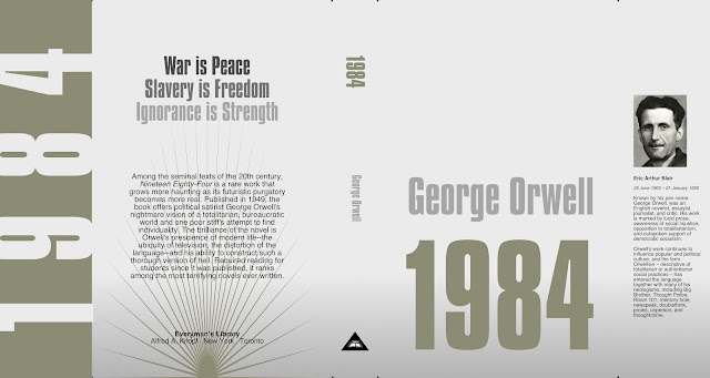
Book Jacket project: 1984

click to enlarge

One style missing form my current project is what I think of as "pure" design", meaning dependent solely on design elements like typography, colour blocks and simple basic shapes. I forgot I had a hardcover of 1984 and it seems a perfect fit for this sort of design. I want to get away forth idea of staring eyes and raised fists and go for something much more basic and, I hope, eye-catching.

16 April 2018

Vectorizer test

click to enlarge

Mike Luce did a test over at his blog with Super vectorizer 2 which I already but only used in a limited way. So I took a really old, super detailed drawing to see how it did turning bitmapped to vector.

As would be expected, the dot and line work looks pretty damn good. It did take some playing around to get there though. The doorway greyscale was done with grey chalk in original and the tones are a little too subtle to be vectorized, but still, not a bad look.

Affinity Designer does not vectorize bitmaps like Illustrator does (barely) so if you need an external program for that Super vectorizer is a good choice and very well priced.

13 April 2018

Book Jacket project: 20000 Leagues Under the Sea and Ghost Stories

click to enlarge

I love Jules Verne novels and have read  quite a few in English or French or both. Captain Nemo was the hero of my youth (along with Verne's Rubor the conqueror). I originally was going to make a 3D version from Verne's Nautilus plans... but the Disney version is just the best. I put it up there as one of the best ship designs in all science-fiction.

Again, I am going for a very clean, open look. I had to redraw the Grosset & Dunlap logo in Designer. I used a coloured gradient to give the feeling of the sea without having to have bubbles, or fish or anything like that.


click to enlarge

This tiny book of ghost stories is the last of my uncovered hardcovers, I think. I guess a way to
continue would be to take some books I love and do new covers for them. I might

11 April 2018

New Drawing - pole cleaner

click to enlarge

Another in my never ending acrobat series. This time I did it all in (digital) ink and painted under it in colour like I used to do occasionally with ink and watercolours on paper. It has a different feeling than my other colour stuff. I think. Hard to look a your work objectively!

06 April 2018

Book jacket project: Murders in the Rue Morgue and other stories

Click to enlarge

Another one to work on from a small format hardcover I have had for decades and oddly enough... never thought to see what stories were in it. There is no table of contents so I added on on the inner front flap. Page numbers to come.

I decided on a long bio for Poe on the back since giving a resumé of each story wasn't going to happen. The photo is the typical one you see of Poe. I did some retouching and restoration to it and might do a little more.

On second thought- I found the above far too banal and predictable and went for something much cleaner. Tell Tale Heart is one of the stories in the book so I went with that for the artwork which I made in 3D. I like this one much better. Numbering the table of contents on the inner flap is a challenge because they start with a one digit number and progress to three digits making it look unbalanced. I changed 1 to 01 which helps a little.

Click to enlarge

04 April 2018

Book Jacket project: Abandoned and Oracle of Nostradamus

Yet more book covers.

click to enlarge

Abandoned is the second book of Jules Verne Mysterious Island trilogy. I've never read (or seen) the third in the series.

click to enlarge

Oracles of Nostradamus is a little book with all the "predictions" he made in French with dubious English translations. Just something I keep for reference.

30 March 2018

Book Jacket project: Tarzan of the Apes


Click image to enlarge

This one came together very quickly. I knew I wanted to use the original cover art so I made a cleaned up version of that and also used the original text placement as inspiration for the book title and author name placement.

It is a very thick book, so the space allowed for more creative titles on the spine and remain readable. I also extended the green background into the back covers the text would be offset.

Flickr post: what just happened?


So I posted a pretty standard image from the old port one morning a few days ago and got a message from Flickr saying 400+ people had seen it by the end of the day... and it kept going and going...

I have no idea why this happened. It's an OK photo, I actually have a few better ones of the same thing I posts months ago. I do have some images with many more views, but they are mostly of guys with no shirts or something and took years to accumulate those views.

I am not complaining, it's nice to get noticed, but too bad those 4300+ and counting views are not on one of my animations or documentaries. In that case, the chances of me getting some work from the attention might be dramatically increased. I just find this odd, this is as close as I get to viral anything. it doesn't look like anyone checked out any of my other photos on Flickr as a result so it's some sort of fluke I'm guessing.

16 March 2018

Book jacket project: The Picture of Dorian Gray

click image to enlarge

So this one I tied to break away more from my habits and it has a sort of paperback book cover look to me. These past three book were all from the Modern Library, so I need to maybe look into my collection and find another publisher. I have a few Jules Verne and Burroughs Tarzan of the Apes, so there are other subjects to cover (pun intended).

I deliberately didn't use black backdrops on the last few because I think that while visual short-cuts are useful and sometimes needed, it's best to at least try and avoid them or turn them on their heads now and then. Horror is always some ornate font, in red on a black background. Dripping blood abounds on these covers. You might end up using some of all of those visual tropes in the end, but it's always useful to take another road first.

The Picture of Dorian Gray is very different from the typical gothic horror story, much more psychological and while there are violent turns, there is also a lot of humour. The monster is our own ego and pretentiousness revealed in the character (and portrait0 of the eternally young Dorian Gray.

The illustration is a 3D render I made to look less 3D prices and more painterly. A skin-less looking hand is pushing it's way out of a paining in an ornate frame that has been covered by an old sheet. I made one image that didn't show enough of the frame which made the image a too ambiguous so I made another. The font is simple and clean. None of the text is pure white, I find it easier to read if the text on black is a light grey over pure white.

14 March 2018

Book Jacket Project: Frankenstein Version 3


Click image to enlarge

Thanks to Mike Luce's feedback, I went in a different direction. Did I want to have no illustration? I really wanted a Wrighson on the cover, afterall these will eventually be covering the books in my library. I also liked the white paper and the larger image lets me have that simplicity without sacrificing drama.

13 March 2018

Design Project; Book jackets

It is no secret my work load has been say... reduced over the last year. Getting new contracts has been near impossible despite some very successful projects in the recent past. I guess a well reviewed design for a book and a nomination for an international Emmy don't really carry much weight these days... at least where I am concerned.

I have been taking up the slack by working on my personal projects, mostly animations. That is fine but I need to keep my design work up as well so I've decided to look trough my personal home library and redesign book jackets for a few of the hardcovers I have. 

So I am going to post my results, experiments and ideas here and hope to get some feedback to keep me on my toes with my graphic design work. My plan is use mostly design techniques but I might also try illustrating a few myself - depending on the book. I will try different styles and looks for each book and maybe even several for each book as I go along.

If I can get money to print these up, I plan to use them in my book collection.

Please: click the images to enlarge to see them in detail.


Frankenstein


I actually did this one before, I think with Pagestream on my Amiga many years ago. I love the Bernie Wrightson illusions for this book and used this one on the old jacket as well. Originally I liked  the stark white over the textured backdrop, but settled (for now) on an old wet plate texture from the days when photo negatives were on glass. I also tried a version with no cover image.


Dracula


I read this books every few years over again and researched 100s of other covers - many of which I found pretty terrible. Again I like a clean look and white as a backdrop would also work for this I think. The skull with wings is a royalty free graphic I slightly changed and I chose a font that was not overly decorative. The blood splatter was something I though I should avoid but then thought this needed little more excitement added.