29 December 2020

Poster: Creature of the Black Lagoon


Click images to see larger versions.

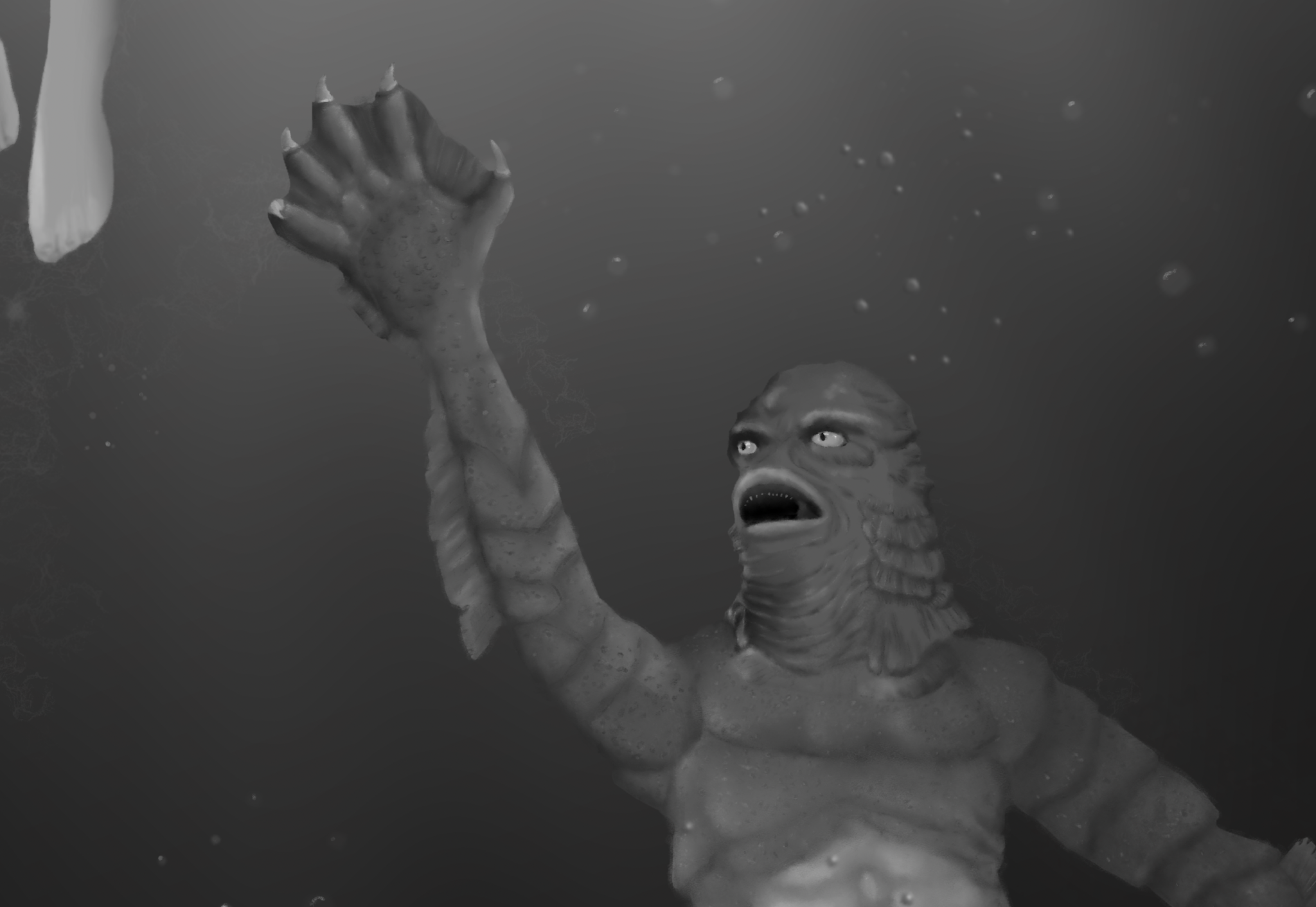
Still not sure how successful this is but it is a much more fully realized illustration I think. It has background and foreground elements and isn't as graphic design oriented as my giant monster  or sci-fo posters. Again done in Krita and charcoal brushes and too about 25 hours of drawing time. There are many details hard to see unless you are close up to it, like the texture on the creature's skin. I used  the blending stump brush like I did with real charcoal sticks on paper. I drew the underwater weeds over and over again, simpler versions just didn't look right. The sketch was a good guide even though I changed some details like how the swimmers foot was postitioned. For something like this I make a detailed sketch so I can make a grey silhouette and then add shadows, highlights and details and the drawing seems to push itself out of the canvas as I draw. The bubbles etc were just freehand with no plan. I just kept at them until it looks OK to me.  

I looked through the film for references and used bits and pieces as inspiration but I have found the clearest references were photos people took of models made of the monster. The film is burry and grainy and the details are often obscured, especially with the pose I was looking to use. I wish I had unlimited funds to buy some of these toys so I could play with more poses myself. 


27 December 2020

2021 demo reel


 It's been a tough year, really tough for me and everyone else in the world. If you need or know anyone who needs animation, graphic design, motion graphics, editing please, PLEASE get in touch with me to work something out! 

View my portfolio site at:

Behemothmedia.com

22 December 2020

Poster project: Nosferatu


I seem motivated by monsters these days. When I get an idea and the urge to realize it I'm trying just close the door to the studio and work until I'm done. I started this one a day ago but did about 7 hours on it today. 

I used Krita again, the charcoal brushes and went through a restored version of the film frame by frame for reference images. I didn't really find a single pose I liked and so I made one up using 2 main images as references and the famous stairway shadow as inspiration for the background. I skipped his hair over the ears, I know it's in the film but it always sort of bugged me so I guess I used a more "modernized" version of Nosferatu. The last few decades that little patch of Brillo pad hair over his ears is usually forgotten favour of totally shaved head. 

18 December 2020

Poster: Monster Zero

Otherwise known as King Ghidorah. I had a nice long chat with my my friend Mike today about art and other things and I was inspired enough to do another giant monster poster.I had been planning this for a few days so it didn't just happen out of nowhere, but my ideas came together and I thought I should strike while I was in the mood to create something. 

The title took longer than I thought. I tried it in 3D but there were all sorts of problems getting the textures right. (I wanted it to be made of rock for some reason.) In the end I went with just using Affinity Designer and adding more subtle  effects to the text.  *EDIT: I could not help myself and did more work on the 3D titles and solved the problems I was having.)

I struggled a bit with the lightning rays... should i do them or not. They seemed over the top so in they went. I used the sort of style I did for Godzilla but with three heads, two tails and wings Ghidoraj was much more dynamic. Again I went through movies to find references but I also discovered some of the toy figures and studio publicity photos had ideas I could mix and match. 

This looks like comic book cover to me but I think it makes a good poster as well. 

16 December 2020

Poster design: Godzilla

 I had to be without my dog for the day as he was at the vet getting fixed. I couldn't really concentrate so I distracted myself by going through the original Godzilla frame by frame to find a never reference image to draw from, then designed  poster around it. It's sort of a clean but retro inspired look I think. 

15 December 2020

Illustration: Tiggles


This is the second drawing of a toy Ive kept since my early childhood. One of my first along with Spot, the dog toy I drew a few months back. Tiggles (Pronounced tie-gels) is a much worse shape and might be a little scary to any kid who inherited now. I drew it in Krita, which I like more and more for drawing on my iMac and after doing the initial pen and ink drawing, added a couple extra layers. One colour layer with the toys electric green eyes and some more subtle red on the nose with light orange in the mouth and another in with some greyscale shading. The grey won out in the end, but I didn't delete the other layers in case I change my mind later. 

The whole thing took about 3 days and about 15 hours. I had to redraw the darker sections as they were too light for contrast after I started drawing the bulk of the fur. I used a solid black and a very dark grey to five the lines a little more tonality. 

10 December 2020

New website design: John Davis Massage

 This was a long term project that went in fits and starts but we finally got it online today. The site had not been updated in 15 years so it had been made for 12 inch screens or something that seems ridiculously small now and it was made by someone else. I only had worked on my own site in years so this was a little bit of challenge, not to design but to upload properly. I forgot what a pain in the ass that can be with some providers. 

John is a really good massage therapist. I have used him when I am in Boston and my sister started to as well. She does triathlons, including Ironman competitions so she is pretty particular about who she gets a massage from! 

Book and appointment here if you are Boston:

John Davis massage

04 December 2020

New project: A Vine on a House (animation)


My next animated short is an adaptation of the Ambrose Bierce short story, A Vine on a House. I have started by making the one and only set piece which is a house on the side of the road - one version of it fairly new and well maintained and then another in a ruined state years later covered in vines. I also have been working on the logo. 

Next step is the make the 3 (sort of 4) characters which I would like to be very simple. No more than 2 appear together at a time so my computer should be able to handle the shots with not too much slow down. 

Another change from my previous project is there is no dialog, something I have tried in the past and abandoned. Since I don't have access to both my voice actors, one I have to go to his place to record which is 500 km and a closed  national border away, this is a good time to do a silent project. 


29 November 2020

Portrait - Robin


 I haven't done a real studio portrait in a very long time and I miss doing them. They used to pay for the studio I had in Boston especially as people needed nice photos for profiles online. I can get a decent set up here in my home studio, it's limited in size but I can make it work. I would like to dump my old lighting setup for LED which will cost me about 500$ but it might be worth it in the long run. 

The photo is mon conjoint Robin and he wanted some portrait for his Face Book profile so he asked me. Of course he hated every single one when I went through the RAW files to see how they looked. After processing the RAW images in Affinity Photo and the using it to retouch them and make them black and white he finally saw the light and seems to really love them. It is strange how my digital work isn't all that far off from my old medium format work. I spent hours in the darkroom to get the most out of the negative and I spend hours getting themes of the RAW file. It is still a lot of work sometimes to get a decent looking portrait, especially since very few people really have a good idea what they look like. 

I used the NIK plugin silver effete pro to start me off with the black and white conversion but I didn't use DXO photo Lab on these, that seems more suited to landscapes, but that's just my ignorance with the software coming through, I think. 

23 November 2020

DXO Photo lab 4 and Nik Plugins 3 (review)


I recently decided to update my NIK collection of plugins to V3 to keep them up to date with my system and also I noticed the installer I had for version 2.5 didn't work anymore with Big Sur the new Mac OS. The update was on sale and also on sale was an update for DXO Photolab, an app I got for free when I last updated the Nik suite. I hadn't really used it much but I did find a few things about it impressive, mostly the noise reductions, but I never ended up making it part of my photo workflow. 

Photolab 4 is a pretty big update. The interface was overhauled for the better and the addition of new features like batch re-naming and tight integration with the Nik plugins made me want to give it a second try and I'm glad I did. I have been looking for anAdobe Bridge replacement for years and this is pretty close to what I want, though it does have limitations I'm still not happy with. It only"sees" RAW, JPG and TIFF files as they are the only formats it can edit. I can see why, but it would be much more useful if it could expand a bit into other formats. I do like that it doesn't make copies of your when you open a p=file but instead gives access to your folders on your hard drive which I have organized in a way I really find the best for me. They added a new, improved de-noiser and I have to say - it is impressive. Sometimes a de-noiser will leave the cage looking smudged or blurring but this actually brings back details and colours. It's amazing. You can open the NIK plugins directly from the workspace, though doing that will create a tiff file for them to work from, so you need to start your work in Photolab and then move on to the plugins to get a finished product. 


Speaking of the plugins... if you already have them and they work you don't need to update. Nothing much has changed except some new presets and one new plugin that does a great job of fixing perspective issues caused by the lens and the angles you might have shot from.  It's really useful but doesn't work inside Affinity Photo like the others do. The plugins have had additional integration into Photoshop and work great there including "Perspective Effects". Luckily each plugin can also be opened as a stand alone program or inside Photolab. They sell another program for Photolab that is pretty much exactly "Perspective Effects" under another name except it might work on files other than tiffs. I don't know as I wasn't about to shell out more money just to find out. If you have the NIK suite, you don't need it. I would still say if you don't have them, get them. They haven't been updated much but they did not need to be. The way you make selections is still quite unique and really makes adjustments that look natural in a photo. I mostly use HDR Pro, Colour Efex pro, Viveza and Silver Efex Pro but occasionally will use Dfine. If I ever need to make sketching look like an old film camera, Analog Efex is really good for that but it's not something I do all that often. Fun to have, though. 

So I recommend both products from DXO with the caveat that NIK Plugins 3 isn't a great deal if you have 2.5 already. 


19 November 2020

Oddly satisfying HDR merge experiment


 I recently, like yesterday, updated my NIK plugins and DXO studio Lab so my apps would all be up to date for 2021 and played with the integration of HDR pro with Photolab by merging 2 random photos in HDR as a test and I really liked the results. I also really liked Photolab 4, more on that as I learn it better. 

I always knew you could get interesting results by combining different images that you might not otherwise in HDR but this has me thinking i should at some point plan out images I think might make a good combo and see where that goes, 

Merge is above and the 2 images merged are below. 


06 November 2020

Franz Kafka portrait


Krita recently added a charcoal brush set to it's tools and I decided to go way out of my comfort zone and do an entire portrait with them and smudging tools. This took about 6 hours to do which is not long for me. I have been encouraged to "loosen up"  by a couple people and this time they were referring to my drawings and paintings. I am not sure if this qualifies as loose.... it was loose for me at least. 

I do have a think for Kafka, I even travelled to Prague to see his museum. there are not many photos of him and I chose a younger version of him as  reference. I sort of wanted to show him more as a young man and not a great writer of disturbing stories. 

I a not not sure I really got a good likeness. I wanted to change his expression from the stagnant, dour one to something more engaging to the viewer. Nothing extreme just a shift in focus. I played with the lighting too. I tried not to be too obsessed with the hair as I tend to want to draw each one in ink and pencil. 

The charcoals were hard to control which helped keep me from my habit of going into super small details. 

I have included the original photo for comparison, not that my sketch lives up to such scrutiny. 


27 October 2020

Jack-O- Lantern (Citrouille) digital painting


 This time I tried something with more dimension to it than a leaf. Painted mostly in Krita with some touching up in Affinity Photo. The actual pumpkin had more bumpiness to its skin, much more than I did here.I don't have the skills to pull that kind of detail off. It looks like what it is supposed to be so that's something. It just doesn't look exactly like the actual object I panted it from. I should not judge it on that criteria maybe since photorealistic is not what I'm trying to do. Still I would like to learn how to paint the sort of highly textured detail as I go along. 

22 October 2020

Nautilus @ 8 months


Been working on this on my iPad for a couple weeks. I started and restarted it a couple times and it's OK now, I think. I didn't want to use and shading tricks other than pencil and pen lines. Drawn in Sketchbook Pro. 

19 October 2020

Ok, one more leaf....


 This time I painted it in Krita to see what those tools were like. I have to say the paint brushes were so much more natural than Affinity Photo which makes sense since one is more for photos and another is made to really try and give that natural materials feel. The mixing of the paint colours over each other really felt like a real brush. leaves are very forgiving a subject so i don't fool myself that I am suddenly a painter, but I see improvement from the first one.

18 October 2020

Another leaf illustration


 I picked up a couple more leaves, to see if I could paint them in a way you can see they are 2 different leaves but the same type of leaf. They look too flat to me as did the last one. I did add a lot more detail into the veins and tried for more variations in the red of the leaves adding yellows, greens and oranges here and there to keep it from look too monochrome. I also added a background to compliment and accentuate the reds. A step ahead? Maybe I should switch to something else and see how that goes. 

15 October 2020

Leaf - watercolour - Affinity photo


 I wanted to go far from my comfort zone with this experiment. I am not really happy with my latest drawings so I tried using the water-colour brushes in Affinity Photo instead of drawing brushes. I didn't really capture the detail of the real leaf. I simply don't have the painting skills for that. I used multiple layers to build up colours and mixed them now and then with a mixing brush so they would bleed into each other more. In short, I really have no idea what I'm doing and thought this might loosen me up more and maybe give me some confidence to move into some areas of art I have been hesitant to try. 

07 October 2020

Phare - canal Lachine

 Procreate practice. Just wanted to draw something simple. 

01 October 2020

Leaf pencil sketch


 I was hoping to have many pencil drawings done after I got 2 drawing pads in January. I want to go back to the pencil and paper basics more often because I think it helps me draw better and takes me off the computer for a while.  This is only my second sheet drawn on since then so it's not going so well but at least it's going. 

The puppy dragged this leaf in with him and I threw it on the drawing table and gave myself 15 minutes to draw it. I am not sure that ebony pencils, which I've used since I was a teenager work so well for me anymore. they are nice and dark but really smudge and lose sharpness quickly. 

27 September 2020

Still taking photos

 It's not been easy getting out to take photos since I still can't really go many places and the areas near me seem all photo'd out. I did see a wonderful sunrise one day on my bike ride and didn't have a camera with  me, but took one the next day which was not as spectacular but still very nice. 

So this is a building going up on the other side of the Saint Lawrence River. It was a challenge to get it looking right with the back lighting and to get that - I want to say metal look of the structure. 

05 September 2020

Cask of Amontillado Selected for a festival you all can watch!

 So the SF indie fest/Another Hole in the Head has selected my animation "Cask of Amontillado" for their online Mr. Holehead's Warped Dimension Film Fest

The festival is the 24th-29th of September 2020 and films will be streamed to a registered Zoom audience. I may also be there in a window for a post screening Q&A live in ZOOM. The link about will have all the pertinent information if I miss posting anything here.

Tickets are now available! Click to see the link and buy tickets. My movie is being shown  on Saturday, September 26 9 a.m. PDT. It costs 10$ for a day pass to the festival so you cna see other things as well! Which is noon eastern Standard time - I think. 

My trailer for the festival:

Cask of Amontillado trailer from Vincent-louis Apruzzese on Vimeo.

21 August 2020

Volcanoes of Io _mini doc 2020


A second mini space doc. I allowed myself to be a little more lax with the images and use my imagination more, but not to an extent that anyone might really notice. I also added some particle and liquid effects which was fun. 

12 August 2020

Nautilus first haircut at 5 months - illustration

This was not the funnest drawing. the subject kept finding ways to reach my Apple Pencil, no matter where it was and chew on it. this happened 4 times. the third time he seriously damaged the pen and I could use it but barely. the 4th time he just mangled it and I had to switch from the iPad and Procreate to the iMac and Sketchbook pro to finish it. 

The eyes and ears had to be redrawn a couple times to get something I liked and get an expression I thought looked natural. It is detailed but I sued a thicker pen size than normal and didn't use my typical technical pen setting but a more fluid pen nib. 

I thought this would be a nice compagnon piece to the the 4 month, pre-haircut portrait as he looks like a different dog now. 

05 August 2020

dessin/drawing: acrobat en repose


This was all done on the iPad, the first try to do a colour drawing all on the device. It was not all done in one app, however. I started in Procreate but had to move over to Affinity Photo to do the doing and burning of the greyscale sections before colourizing them for the final look. Procreate can't do that. There was a lag with the Apple pencil as I went along, some of that was an Affinity update in the middle of the drawing process and seems to have worked itself out after a day. It gave me a good excuse to get into the very different interface on the iPad version of Photo and I have much better grasp of it now. 

This was maybe not the most exciting of my acrobat drawings but  beggars can't be choosers and there were no free shows for me to get new references from this year. 

30 July 2020

Moons of Mars - short doc project


I have been working on this slowly for a long while, collecting textures from NASA and information to make an under 2 minute doc about the moons that go around the planet Mars. I posted this earlier with narration by me and then couldn't live with my voice on it so changed the narration to text which works much better.  Third times the charm? I redid the shot of the three moons since the proportions I had were very far from the actual ones. 

I might make series of these about different space subjects that interest me and can be boiled down to under two minutes. 

18 July 2020

New(wish) tech and updates


I recently was sent a 2015 iPad pro from my brother after he bought a top end 2020 version. I had been very curious about how close they were to letting me replace my laptop, at least on most trips away with something lighter and easier to use while away. Transferring the data from my iPad 6th generation which was still pretty new went really well except for some reason, my PDF files in the Book App are not aviable or even recognized on the new device. For the most part, I plan to draw on it and after using Sketchbook Pro and Procreate on it, it excels for that. I also am waiting for the iPad version of Affinity Publisher to get released so all my design, illustration and photo work can all be done on the go with no loss of functions or quality. the only thing I will not be able to do is my 3D work, which is something I rarely do while away but do it enough to keep the laptop for now. It's sort of ginormous so it's less handy as a purely mobile device. It's basically the same size as my laptop but with a better screen and actually a little faster.

I sold my iPad 6th generation and it's accessories like the keyboard cover, bag etc for enough money to get a new bag for the new Ipad Pro and to fill a need or two that a huge Pro model can't be used for - I bought an iPod touch. Yes, they still make them even though you have to hunt for long time on the Apple site to find them. It's pretty much like it's been for years but that is not a bad thing. I can put it in my bike riding shirt pocket and stream podcasts to my wi-fi riding glasses as I do my longer rides with no problem and without have to drag a suitcase with a large iPad in it behind me. 

I also updated my post blur effect plugin of choice, Reel Motion Blur, for Apple's Motion app and it works great, faster than in After Effects it seems. X -Particles plugin for Cinema 4D also updated this past week with some very cool new features I really could have used on some of my past projects. I know, these are all technical things no one but me knows anything about as a rule, but I find it exciting. 

Once Affinity Publisher comes out for the tablet, I'll be in a place I rarely get to these days... I'll feel like I have all I need to get what I want to do for work and my personal projects. Nothing I have is the most powerful anything, but it'll good for me to get things done. 


14 July 2020

Goslings - drawing


Drawn in Procreate on the iPad Pro.  Referenced from several photos I took on my standard 65 km ride along the river and canal one morning. Lots of white space at the top to hopefully emphasize how small they were. 

30 June 2020

dessin/drawing: Nautilus at 2 months


My new puppy, Nautilus - named after the Submarine in Jules Verne's classic novel 20 000 Leagues Under the Sea. This was drawn on the 12.9" 2015 iPad Pro my brother gave after the upgraded to the newer model. I used Sketchbook Pro but Procreate would have done just fine. 

The new iPad is pretty amazing in terms of speed, power and screen size/quality. Much better to draw on than the smaller base model I had and just sold. I will saw it's so large as to be ungainly. It's not easy to set on your lap and draw, it is pretty much the same size as my laptop. Next photo trip somewhere it will be amazing to have. Normally I have to bring the iPad to get around with and my laptop to process and store the photos taken. I can do all the photo stuff on this and just take my iPod touch with me walking around which will be a lot easier. I can also just sit and draw something when I'm away easily and in great detail as I think this image shows if you click on it to see it larger... I didn't skimp on details. 

It will take a while to get used to the new device... and the rotten pest who is eating something he shouldn't at the moment. 

23 June 2020

Animation: The Cask of Amontillado 2020 6 minutes 14 seconds


After about two years of preparation and animation my animated "The Cask of Amontillado" is finished. Mike Luce is the voice of Montresor and Michael Z. Keamy is Fortunato. I tried to be the voice of Montresor at first but I was beyond terrible and Mike Luce kindly redid that audio for me. I went with human like animal characters this time instead of cartoon humans. I thought it might work better and give me more options with the animation plus added some symbolism. 

I used Cinema 4D as I am not ready for something like this in Blender yet. It was edited in Final Cut X and I did not use After effects for the compositing but used Apple's underrated and often ignored Motion software instead and it worked out great. The animation still has some issues I am having trouble with, such as decent walk cycles and some of the movements were not as smooth as I would have liked but overallI am very happy with the results. Nothing is ever perfect, is it? The settings were a long haul to make as the upper and lower catacombs are huge and cavernous and lit by torches. The sound was a little more complex as I had to record a bunch of foley and sound effects to flesh out the sound and add more atmosphere and detail to the short. 

During the final edit, I noticed a bunch of things I had somehow missed, one was the wrong source files were used for a sequence which made the image looked pixelated and another was a terrible clicking noise during a dialog scene I can't believe I had not heard during the editing process. My excuse is that the noise here is non stop between the construction and the fact I am not in glorious isolation but home with my spouse which does not give me the solitude I need to work efficiently. Constant distraction is death to a project like this so I am glad I was able to get it done and be happy with the end result. 

I have two posters ready in case I decide to enter it in some festivals. I have had the luck to be in one or another over the last 6 years so having promotional stuff ready is a fun way to tie up a project in a nice bow. 

If you like the animation, tell me! Like it on Youtube and pass it around so maybe it can get some attention and love! 


10 June 2020

Star trek poster series - maybe.


Here is a test for a Star Trek series of posters like the others.  If I go on with it, it will have more info, the Desilu logo and some other poster stuff. The shuttlecraft I made form scratch but the enterprise is a simple 3D model I found online and will likely replace with one I make myself.  I like the colour scheme... it's sort of something you might see for toys and it less somber than the 2001 and Star Wars posters.  These 60s Trek ships have more details than I remembered. I might try making new one sin Blender as part of my "learn Blender" effort.

The logos and Shuttle art was all drawn in Affinity Designer and exported to the appropriate format for texturing if needed.

The Klingon ship was just one I found and seems a little more detailed than in the first series but looks nice. Could end up making this myself and a Romulan as well.

03 June 2020

2001 poster series fixes


As mentioned before, the 2001 models I had found were lacking in some ways. Some had issues with the texture maps which was where most the of the details were and other just lacked details. While I am still not trying to be super faithful to every details, it did bother me that a couple of the images were just too simple and slapping on a bump map did not really get the images t where I wanted them. So I kept some elements and made over from scratch others. On the Discovery it was mostly changing the textures and making the main control sphere and the reactor and engines myself. With he Moonbus, it was a matter of adding a ton of details that were lacking. I watched the film again and it then could not just let my fun project stay as it was.

The top image you can see I added a ton to the rear of the sip, there was almost nothing there before which was why I opted to show only the front. For the front - here is a before and after, I think it's improved. It could probably still use some details from inside the cockpit but I think the blue light is better than the yellow.


The Moonbus had many more details than I remembered and so I added a lot more into the existing model. Not sure anyone would notice but me but since these were for me, that was enough to get motivated to do the extra work.


*Star Wars got a little love as well.


27 May 2020

Star Wars posters series


Well... why not?  Click to see larger versions.

The Star Wars models I downloaded from the internet over the years are a much higher quality than the 2001 models. I think that has a lot to do with the fans being so numerous and picky about  authenticity. Another factor has to be the age difference between the two properties. I have a feeling many of the 2001 models were made closer to the beginning of the home computer revolution while the Star Wars models are more recent. The models based on the Kubrick film seem to be super simple as if they were made for less powerful processors and with older 3D software. So there was some playing with textures but the overall geometry and details were spot on in most cases making the poster process much faster.