26 December 2021

Illustration: Nautilus septembre 21 2021


Krita gave me a nice surprise with the final update to version 5 coming out right at Christmas. I haven't been sleeping so I had more time than normal to try it out with a painting of my dog Nautilus. It is a different style than I am used to. My first idea was to block out the shapes and colours then go over them with brush strokes to detail the fur but I started tried some thicker strokes and I sort of liked the effect and went with it. I used black, white and dark blue/grey for the fur and did very little blending. Kind of a bold colour palette.  So one more done before the year ends.

25 December 2021

Illustration: Keamy (portrait)


This time a used Affinity Photo to draw another portrait of another friend. I was on the beach in Newburyport with him and took some personal photos under not great lighting conditions. A couple came out nice enough and a few more made me think they might be transformed into a portrait. I have been visiting a friend in hospital and was able to do a few hours of this there on the iPad. I had to play with the lighting and decide how much detail to include on the clothing. At one point I was thinking of just the floating face on the canvas. This was sort of a sneaky portrait since he didn't know (more did I) that is was going to do one. I would like to do more but I asked a number of friends a while back and they all refused. 

I did have some issues with palm rejection and the pencil switching from brush to eraser on its own. Procreate let you turn the device without it automatically changing orientation and Photo had issues with that as well. 

22 December 2021

More illustrations done on my voyage to Massachusetts


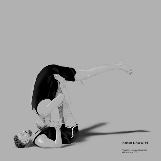
 Another pen and ink style drawing o Nathan and Pascal. I think I have one more to do of them before this series is finished. 


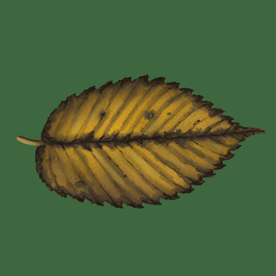
A yellow leaf. I have, it seems, a small series of leaf paintings and illustrations. I ought to put them in a separate folder maybe. I just finished another one that I won't bore anyone with here but it's a "thing" with me apparently. 

Not sure Ill get anything else done drawing wise this year... it was  a HUGE year, actually 2 years for my artwork. Some years I didn't produce even one drawing, lately it has been several a month! 

16 December 2021

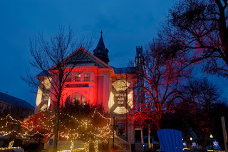
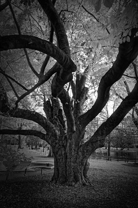
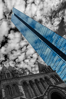
Photos from Boston area visit

 I recently had to visit Boston, no easy task with the covid testing and restrictions. Getting around to anyplace was a nightmare but after getting there, it was super nice to see family and friends. I finally got to take out the camera and really takes some photos. Being stuck here on the island for a couple years sort of limited my subject matter. Another aspect of this trip was to not bring a laptop but only use my iPad pro which has a terabyte of space and with Affinity photo installed, should be enough to process most of the photos I take while away. This was pretty efficient and made travelling pretty easy. I did miss some plugins I use often but there is no reason I can't just take the iPad with me from now on. Once Affinity gets a tablet version of Publisher released, I should be able to do pretty much everything but 3D works it. I am used (spoiled) by my 27 inch screen but the tablet screen was, honestly, more than good enough while running around from place to place. 

Click images to see them larger.

Provincetown.

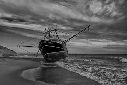
I never get tired of this place and the beach, dunes and town are always changing enough to keep my camera lens trained on it. I was super lucky to be there when a boat got beached in nearby Turo. 


Boston

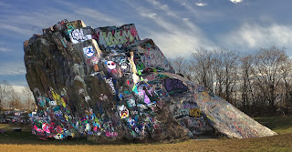
Boston has changed so much since i lived there that it is now an unfamiliar place to me. I got lost a couple timesaver got my bearings back. I took new photos of places I had photographed 40 years previously, with limited success. I also spent some time in Quincy Quarry with a friend and that was interesting.


Newburyport

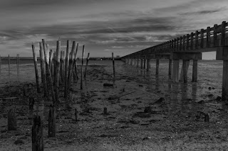
I have been here before and it's really lovely to walk on the wood pathways to the beach. I have only been in wintry times so the place is always pretty much deserted, my favourite way to visit anyplace! 


07 December 2021

illustration: Dan portrait (Procreate)


I was little hesitant to post this since it will hopefully be sent as gift to the subject as a surprise but since he, like most people, never read my blog I decided to take the chance. Below is the detailed sketch I use as a guide when drawing, I like to have an overlay sketch to keep things from getting distorted and to remind me where details are. I am unsure how good the resemblance is. partly becuase its really hard to do that sometimes when you know the person really well, and we have been friends for many decades at this point. I also had to work from photos he has sent me since he moved to Orlando and they are great for me to look at but not always the best choice for a drawing. We are both avid cyclists so I wanted that represented. I think the strap might be changing the shape of his face enough that it's throwing the likeness off a little. I tinkered a lot with his expression which was slightly dour, in my opinion, and a slight smile is more "him". 


16 November 2021

My film at the "Another Hole in the Head" festival! December 1 - 15th online!


 My film "A Vine on a House" is selected for presentation at the "Another Hole in the Head" film festival.

My film will be streamed online as will much of the festival so anyone can watch. The festival runs from December 1-15th, 2021

Festival link

Link to my film

Please support my work and the festival, they are a great group of people! 

12 November 2021

Illustration: Flex 01


 I knew this would be a challenge and it was. The model was a good friend and a really wonderful guy. He started yoga and had transformed his body into something muscular and ripped. Not that he was anything but adorable and sexy before, he just took it to another level. He posed for a good number of photos and drawing this really let me appreciate how defined he had become. This reference photo was taken as sort of a laugh. Its a typical muscle magazine pose in many ways but I sort of love that the underwear isn't skin tight but loose and comfortable. This is actually taken from 3 reference photos, one main and then I used the others for details. One was nude but I think the underwear humanizes his ideal physique in some way and says something about him other than "hottie".  

08 November 2021

Illustration: Pride dancer (2017)


More inspiration from old photos. This time it was a dancer in the Pride parade in 2017 I thought might be a good challenge. To make it more interesting, I decided this would be my first colour Procreate painting. Procreate is missing dodge and burn tools that I use to darken and lighten areas, particularly with clothing and I had to work around that. How round can I make those butt cheeks look? Pretty round it turns out! I have to say the new Procreate update didn't help much in this project. The stabilization was nice but I didn't use the colour cards and while the 3D additions are interesting, they seem gimmicky for a drawing and painting program. It does show that higher end 3D files can be put on the iPad som maybe someone else will pick up in that and I can do 3D work on the device someday. I found the small previous update that allowed me to go from 4 to now 88 layers on this sort drawing much more exciting and useful. 

Back to the illustration. Despite missing a feature I use a lot, I still got some roundness and dimension I think. Procreate blending is all done with the smudge tool and it's workable but nowhere close to the multiple types of blending brushes I have in Krita. Despite the limitations I will do more colour work on the tablet without a doubt. The portability of it outweighs the inconveniences and I hope this proves I can get similar quality while on the run. 

02 November 2021

Illustration: David dance o2


 This was different sort of challenge. The reference photo was a scan from a session I did almost 30 years ago of a print that had been damaged by water. The negative and the prints are long gone and the paper used was textured so while I loved the pose, it wasn't something I could use anywhere. So I thought turning it into an illustration wit Krita might be a good way to "resurrect it". 

Another challenge was that the reference was black and white and I wanted it to be colour. Luckily the dancer was a good friend and even rented my spare room for a time so I had other photos of him that showed off is skin tones to work from. 

The graphic element in the background seemed make him stand out more than just a solid colour would. 

29 October 2021

illustration: pont pour Katherine & Julianna


My niece (and godchild) asks me to do illustrate the bridge she and her girlfriend see from their new apartment, so of course I did! It's an 11x17 inch piece and will be printed that size when/if she approves it. 

I have not done a landscape painting since... not sure when. I might have been a teenager the last time. Have one a couple pen and ink landscapes but only a few of them filled the canvas completely. Most were of a single subject with some scenery and most overall are of old barns. 

Painted in Krita and it was a challenge. I have been using very organic subjects  like people and the precise curves and straight lines for something this large were not working out. I ended up using Affinity Designer to sketch out the bridge part with vector art and then import it in sections as png files to paint over. 

To be honest, I have no idea what I think of this as it is so far out of my wheelhouse these days. I tried not to choke it with details and simplified the water and sky to keep the attention on the bridge itself. Hopefully, they wont hate it! I did respect their very odd request to NOT have giant tentacles coming up over the bridge. Kids today! 

24 October 2021

Illustration: Michael stretch


 Procreate, digital pen and ink with digital white pencil. Another from the vaults. I went back and forth over keeping his tattoo and decided it added to the drawing. There are many more little dots in this than you can possible imagine. I also tried the smudge tool in procreate which I have had issues figuring out. It's good for blending colours as I have found out and that was the missing piece for me to try a colour painting in Procreate. So... I guess I should try that soon. 

21 October 2021

Illustration: Sterch 02


Another inspired from my catalog of old images sitting in folders. I think this has a more natural paint look to it. I added a more "studio portrait" backdrop than I usually do. 

15 October 2021

Next year's big project: Artbook and prints for sale


As work becomes harder and harder to get, I have to try different ways to pay the bills. Over the years I have sold a 1 or 2 prints a year of some of my drawings. It doesn't add up to much but it makes me feel good and i think shows there is potential to sell more if I can figure out how to go about it.  With that in mind I made  plan to produce and sell a book of illustrations on Amazon and tie it in with selling prints. I plan to sell with an online service that will handle the printing, shipping and taxes. I have several places in mind but any advice is more than welcome. 

The book will feature illustrations of acrobats, athletes and dancers - my most popular subjects. This won't be a retrospective or "best of" collection but include only images I will be selling as prints and ones I think will sell the best. I think having a book out there will help sell the prints and vice versa. I won't include any explicit nudes because I think that might be forbidden on Amazon even for art books and will limit who can see the work. I have a large catalogue to choose from and the idea is to not try and put it all out there at once but see what happens and add maybe an image a month to the print site so there is always something new and if things go really well, produce a second book in future. 

This is plausible but is it possible considering I have zero social media presence and I am not exactly a household name in the art world? I might have to break down and open "Behemoth media" accounts in Instagram, Facebook and whatever else and hopefully convince some of my friends who already have accounts to like and help promote my work to get it out to more people. 

Here is the design layout, the inner title page looks good to me and I decided the full images on the right and a close up of that image on the left would be visually interesting and give the potential buyer more information on how detailed the pieces are. 

So the plan is to finish some new drawings... I have about 15 lined up and most are hopefully for this project if they work out. Picking the right ones is no easy task. This will take months to finish so I am hoping to get it going for real after the new year. The text will be both English and French.


11 October 2021

illustration: David 01


Procreate ink and white pencil. The reference for this was from a series of photos that I took almost 30 years ago with my friend David who was dancer and taught colour guard to high school students. Sadly most of the negatives disappeared before I could scan them so I only have scans of finished photos printed on textured paper so they don't look so great. I have at least one more that might be better now as a drawing and "redeem" my old photos somehow. We had a lotto fun and he was so great as a model, I wish I knew what happened to him. 

08 October 2021

Illustration: Tony 06

 
More inspiration (desperation?) from my collection of photos. This wasn't ever meant to be a drawing, but I really liked the photo and thought it might be a challenge to get his shiny skin right. To my surprise, I did the sketch and basic colour fill of the form yesterday and the rest today with only about 5 hours of work. I think it is because this is ALL skin with very few little details to worry about like folds in clothing or textured or wrinkles in the skin. Not a complicated hair style either. I feel oddly proud of this, something I never feel when just finishing anything. In some ways being forced into my old catalog of images has been a big plus, though I would still like the chance to take new images with new subjects sooner than later. 

Painted with Krita. 

02 October 2021

Illustration: Diver 02


 Done in Procreate. The drawing process was fine but exporting it was a nightmare. For some reason neither Procreate or Affinity Photo will save to my Dropbox account and that is normally how I get things off the iPad and into my storage drive. In the end I had to use a USB drive plugged into the iPad to transfer it it. Not sure if it's because of the new iPad IOS update or not. Seems likely. 

30 September 2021

Documentary: Parc de L'espoir (2021) Directed by Vincent-louis Apruzzese


I added new material to the end of my 2014 documentary abut the AIDS memorial park here in Montréal. The park has been completely renovated and it 4 times it's previous size as well as much cleaner looking and inviting. I also added English and french subtitles to make the doc more accessible. 

The You Tube link is not showing up on the blog right and that is the one with the English subtitles so click here is you want to see the new version! 

25 September 2021

Illustration: Runner


 Painted in Krita again. I tried to draw this severalties in the past and always trashed the results. The reference image is blurred and terrible but I gave it another try and I'm much happier with it now than in previous attempts. I decided to make it more about contrast than straight forward detail and that seems ot be the best choice. I had planned to get new references when the Montreal annual marathon passes by my house but, like last year, it was cancelled. GET YOUR DAMN VACCINE SHOTS EVERYONE!

19 September 2021

New business cards to correct a design mistake on the previous ones.


 Earlier this year I redesigned my business cards. I don't use then very often but they do come in handy now and then. The old ones were a stale design, they needed an update and more modern cleaner look. The new design I really liked... until they arrived in the mail and I knew I made a serious mistake. They were far too dark and not easy enough to read.

Things can look great on your 17" RGB 5K monitor but when printed on paper in CYMK on paper the ink can absorb and diffuse the colours, muddying them. Contrast is your friend in print projects unless obscuring details is part of the design. I didn't even dislike them, but i knew they were not going to get attention or even read because of the lack of contrast.

So lesson learned/relearned and I kept much the same design look but made sure all the information was readable from a distance and clear. Before they were black on dark grey and now the logo stands out and  I added my phone number back in. I don't really want to be called on the phone and prefer email but having phone number lends more credence to me being a real business.

15 September 2021

Illustration: Paul torsion assise


 A bit of skin in my last 2 drawings I guess. This was from 20+ year old references as well and the quality was better than my recent diver references but still somewhat degraded. I had quite a few of them this time so I think I got more out of this one. You don't find many guys with muscles as defined as this. 

I did have to change the pose and some details slightly. This was mostly for clarity of the image. A few toes from the crossed over leg were really distracting and there was a hint of penis which is not something that I would normally hide but it took me some time to even know that was what it was. I also removed his tan line. To be honest it was pretty sexy looking but, again, distracting from the pose. I thought emphasis was on the shoulders and back, not his butt. 

11 September 2021

Apple iPods

 When I bought the new iMac, they came with Apple iPods, a 200$ item. I would never pay that sort of money for earphones but for free, I was all in!

I ride with wireless headphones so I can listen to podcasts for the 3-4 hours I am on the road and high fidelity sounds isn't a big deal to me. I just need to be able to understand what people are saying. That said, the sound on the pods is very, very good and they come in little charging box that helps them be useful longer. They are more comfortable in the ears and can attach and switch from one Apple device to another which I have done now and then since getting them. They pair quickly (usually) and I like the double tap I programmed to turn them on and off. 

What I don't like about them is that I really can't use them while riding. They fall out of my ears too easily and that is disastrous and a bit anxiety producing. While I like the programmable double tap feature, you can't change the volume that way - something that seems super basic and big omission. The screen on my iPod and iPad will show them connecting but sometimes I still have to go to the bluetooth setting to connect them for real. They are more susceptible to interference while walking around I have found. These annoyances don't take away fro the great sound and comfort so while I don't use them all the time, I am hardly sad to have them. I can imagine that are really good on long trips to listen to movies etc, should I have be on a trip somewhere again. 

08 September 2021

Plongeur / Out games MTL / diver 01


Much quicker turnaround this time from start to finish! Only about 7 hours of work. The reference photo was old grainy and not great but I liked the pose and the sort of calm before the storm look many athletes have directly before an event starts. I had more detail planned for this one, like painting the pool in and there should be railings on the diving board visible - but I felt they were distracting elements, adding nothing. Once I finished the diving board it looked done to me. I found another image that might make a nice pen and ink style drawing. I really need to find a way to get reference images of more athletes doing their sport. And yoga as well. And dancers. I used to have easy access to all that years ago and never really had the time to take advantage of it, now I'm not sure how to find willing models at this point. 

05 September 2021

illustration: Nathen & Pascal 02


I don't know why but this was a long one do paint, about 35 hours. I tried not to obsess over the fingers, toes and ears - things I often work on for hours and hours because they are complicated to get looking right - obviously I did not try all that hard and obsessed anyway. 

Lots of hidden details in this that are only visible close up or in a print. The upper tank top has ridges and I drew them all so the material wouldn't look shiny, as shiny as it would have looked without that texture added. I went for more contrast in the skin tones between the two guys and I think it was successful. Pale skin is harder for me to render than darker skin. I don't know why I picked that colour for the background but I'm glad I did, I think it's nice compliment to the 2 skin tones. 

It might not seem it but this is more "painting like" than many of my previous colour illustrations and the transition between tones is rougher so I might be getting away from my pen and ink level of detail and letting myself work a little looser with paint. I notice it anyway! 

04 September 2021

27" iMac, 10 core i9 with AMD Radeon Pro 5700 XT 16 GB and 5K screen

 I recently made a huge decision and upgraded to the higher(est) end iMac and sold the machine I only bought in 2019. There were several reasons that seemed important, at least to me. The former imac I bought when it's predecessor exploded while I was working on several projects and I needed something THAT DAY. With limited funds and time I got a pretty much base model and while it was slightly faster than the one on fire at the moment, it wasn't a step up which is what I need after having a computer for 6 years. Then the pandemic hit and it seemed pointless to upgrade with no work coming in. I am convinced eventually the M chips for the new Mac lineup will take over but not as quickly as they might hope with the chip shortage etc going on. I also use an older version of Cinema 4D with a ton of plugins that will not weather that transition so well. I could have spent 8 grand on a Cinema upgrade and 4 grand on a new computer... but then I would have to live in the box the computer came in. 

The new machine ticked off a lot of boxes for me like increased rendering speed by, well, A LOT and even better performance with the few games I play. Apple now also only sells with SSD drives and while the fusion drive was fine for the years I had one, application just popping open after a couple seconds is really easy to get used to. The rumours of a 30" screen coming up was a temptation to wait but I already use 2 17" screens to work on and a new design isn't a big motivator for me. I use these for work, not decoration, and I wasn't exactly horrified by the look the iMacs already had. I don't care how thin my desktop is... it's on my desk. I am not moving it around and most of it faces a wall. 

My spouse is a teacher and I do much of his graphics for his classes especially - when everything went online for a year. This lets us buy one at the educational discount which isn't huge, but it certainly helps. I also know selling my other would cut a big chunk off the price and I moved the extra RAM I installed in the old computer into this new one so I did not have to buy that. 

Still it was a big investment to make with no guarantee more work would be coming in to justify it. I did know if more did come along, especially CGI work, the old computer wouldn't cut it and I would have to get something faster. So better to have it now. I should be able to edit up to 8K video now with no stuttering and my current animation project is much easier to work on with the new graphics card and processors. It's probably the biggest speed and performance bump I have ever experienced going from one computer to another. 

Fellow artist, Mike Luce bought one of these a while ago and he gave me me advice on my decision which I found very valuable. There was a big speed increase in the Affinity lineup which I am totally profiting from now and Blender will have a big update fairly soon and that already runs super fast so I am looking forward to doing a project with the exclusively. One can only draw and paint so fast but the opening on Krita (also updating very soon) and saving large files is done in seconds now and not a minutes. 

I am still in sticker shock but I can't imagine that I will regret doing this and it should be with me for quite a few years to come. 

21 August 2021

dessin/illustration: flamant des Caraïbes

 
From my recent visit to Zoo Granby. I haven't really painted birds much and doing the feathers was interesting. The reflection was a challenge as it's so loose and the water as well. I am not known for my "loose style" of anything. I worked on this at 400% magnification so many details won't be visible unless it's a large file or in a good print, but that is my typical magnification when working. 

I used Krtita, I wanted to wait until the new version is released but that is going to be September and I have plenty to draw before then. 

14 August 2021

Nathan & pascal 07 : illustration/colour

 This took a while and was a good challenge. Not sure it is what I was going for but to be honest I didn't have a strong plan to start with. I am happy with the hair which I seem to be getting better at and the rock they were on top was interesting to do. This was painted in Krita and I used the recently released crayon brushes to give the rock a rougher feel. I played with a solid background but in the end decided on textures because I think they make the acrobats stand out more. 

Krita is on the verge of a big update with rewritten brush engine and a ton of other things so I almost wanted to wait to do this, but I have several other projects of them in the pipeline so no real reason to wait.  I am also having a new iMac that should be substantially faster and more powerful delivered next week so I'll be wanting to see how Krita performs on that after it's update. 

08 August 2021

Nathan &Pascal Drawing 01 +


 I uncharacteristically approached two guys practicing acrobatics in the park a couple weeks ago and asked if they would like to pose for reference photos for a series of drawings. I am pretty anti-social, to say the very least, but they were so nice and enthusiastic after I showed them some of previous stuff that I was glad I did it. 

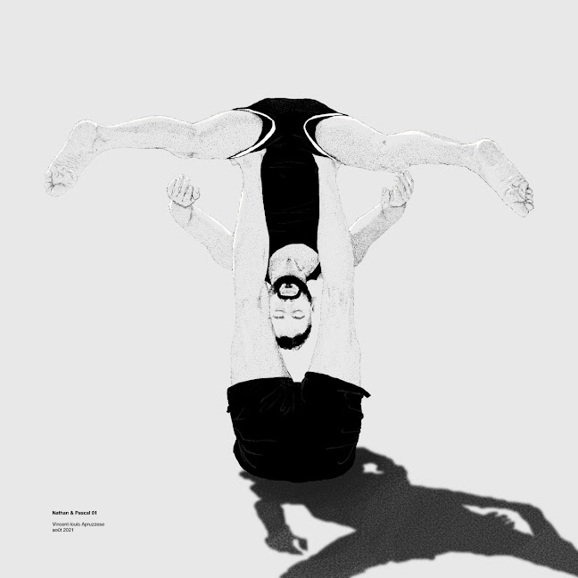
This is the fist in the series. Drawn in Procreate on the iPad and I liked the sort of upside-down feel it has. I went back and forth on wether to have a shadow, or to show the yoga mat they were on. the shadow was sort of wild and I thought it went well with the rest of it. 

I also did a simplified sketch in Affinity Designer, something I have been experimenting with as it's a million miles away from my usual drawing style but has it's own challenges. I think I captured the weight of the pose with very few lines so I think it is a success. 


02 August 2021

drawing/dessin: suricate Afrique


A trip to the zoo with my 2 year old nephew let me take some reference photos of animals I might not see while riding my bike around Montréal, including these guys. 

I used Sketchbook Pro on the iPad pro as I was reminded about it recently by reports online that has left Autodesk and is now an independent application run by artists. It has been free, but will now be paid. It will be pretty cheap and it's great they will continue to develop and improve it. 

The drawing itself is nothing to brag about. I haven't drawn in a while and I did a photoshoot with some acrobats for future art and felt I needed a "warm-up".  This came together in just a few hours. 

11 July 2021

August updates? Affinity, Procreate and Krita

 While no official dates are announced, it seems a few software companies have some updates happening  most likely in August. 

Affinity Suite:

Designer was just demonstrated with some pretty powerful speed updates, all software based so every computer should benefit. In the demo, 600 000 (!) layer objects were panned and zoomed with no redrawing to be seen. I don't anyone who uses that many objects but the point is to get the suite ready for some new features. Affinity is reasoning, rightly, that it's better to get the bugs out and really have sold base before introducing some calculation heavy features. Photo and Publisher will benefit form this speed enhancement and I have my fingers crossed that there will be an update in August that includes Publisher for iPad. 

Krita:

Krita is about to go to version 5 and there are a ton of updates planned. For me the new animations features will be really helpful. I liked drawing in Krita but the animation functions were buggy, slow and lacking. They seem to be addressing all that and updating the interface. I would love to be able to use it for drawing and animating since the drawing the tools are so amazing.

Procreate:


Procreate teased us with some video of the upcoming new features which included 3D objects you can paint and add to real world images and maybe video?. I can see a use for say making a some stuff in Blender and then sending the object file to procreate to make detailed backgrounds or as the base for a drawing but I'm not sure about anything else. Photoshop added 3D many years ago and I never used it for anything. They already tweaked it for the M1 chips in the iPad pro so I have a ton more layers to work with and Apple seems to have heard the frustration about the 5 gig max for apps that Procreate brought attention to and iPad OS 15 will address that. 

Blender:


Blender is close to a 3.O release and the new Cycles render engine loose amazing and makes me feel the need to switch much more acutely as I don't think I'll be updating my computer anytime soon and really could use a boost in render speed! 

30 June 2021

A second self portrait - sort-of


 I recently updated the design and re-arranged the stories in my first book of short stories. I cut one and added a new one and also added illustrations for those that didn't have them the first time out. The story "The Face in the Glass" was a head scratcher in terms of what sort of image to make and I ultimately deiced something "punk-ish" might be good. Originally I was going to do a mohawk only from the side. I decided instead to really simply and stylize a photo of me from the 80s. So not sure it counts as a real self portrait or not. I wasn't really going for resemblance as much as I was going for a certain look - much like I was going for for myself in that era! It would have been cool to colour the make-up but the book is printed in black & white so greyscale had to suffice. 

The book is for sale on Amazon as a printed book and a Kindle book.

The new price is 5.99$ (CAD) and the print version should be updated in the next few days, but the Kindle version is ready now. 

19 June 2021

illustrations: Trois femmes influentes Louise brooks, Pam Grier, Nichelle Nicols


A style I wanted to try out. I also wanted to do them all in Affinity Designer  for yer iPad since I am not really familiar with the interface and want to use the iPad pro much more for design, graphics and art over the next year. 

Nothing special about the images really. I don't exactly have access to any of these women to take my own references so I used pretty well known photos but the point wasn't originality but to play with this style of portrait.